Cara Membuat 10 Animasi Scroll CSS & JS yang Smooth

Animasi saat scroll bisa bikin tampilan website terasa lebih hidup dan modern. Selain itu, efek ini juga membantu pengguna lebih nyaman saat menjelajah halaman. Di artikel ini, kamu akan belajar cara membuat animasi scroll CSS dengan 10 contoh yang bisa langsung dipakai, ditambah JavaScript agar hasilnya lebih smooth dan responsif.
Kenapa Animasi Scroll Penting untuk Website?
Pertama, animasi scroll meningkatkan user experience karena halaman terasa lebih interaktif. Selain itu, efek visual yang halus juga bikin pengunjung betah lebih lama. Bahkan, banyak landing page modern sudah menggunakan teknik ini untuk menarik perhatian.
Di sisi lain, animasi scroll juga membantu menyampaikan informasi secara bertahap. Jadi, pengguna tidak langsung “dibombardir” dengan semua konten sekaligus.
Persiapan Dasar Sebelum Membuat Animasi Scroll
Sebelum mulai, ada beberapa hal yang perlu kamu siapkan. Pertama, pastikan struktur HTML kamu sudah rapi. Setelah itu, gunakan CSS dasar seperti opacity dan transform karena properti ini lebih ringan.
Kemudian, tambahkan JavaScript untuk mendeteksi posisi scroll. Dengan begitu, kamu bisa mengaktifkan animasi saat elemen muncul di layar.
Cara Membuat Animasi Scroll CSS (Dasar)
Secara umum, konsepnya sederhana. Kamu hanya perlu menyembunyikan elemen di awal, lalu menampilkannya saat di-scroll.
Contoh sederhana:
.box {
  opacity: 0;
  transform: translateY(50px);
  transition: 0.5s ease;
}

.box.show {
  opacity: 1;
  transform: translateY(0);
}
Lalu, gunakan JavaScript:
window.addEventListener("scroll", () => {
  document.querySelectorAll(".box").forEach(el => {
    const pos = el.getBoundingClientRect().top;
    if (pos < window.innerHeight) {
      el.classList.add("show");
    }
  });
});
Dengan cara ini, elemen akan muncul secara smooth saat di-scroll.
10 Contoh Animasi Scroll CSS & JS yang Smooth
Berikut beberapa animasi yang bisa langsung kamu coba:
1. Fade In Scroll – elemen muncul perlahan

Full Code Fade In Scroll (Siap Pakai)
<!DOCTYPE html>
<html lang="id">
<head>
<meta charset="UTF-8">
<meta name="viewport" content="width=device-width, initial-scale=1.0">
<title>Fade In Scroll</title>

<style>
* {
  margin: 0;
  padding: 0;
  box-sizing: border-box;
  font-family: 'Segoe UI', sans-serif;
}

body {
  height: 200vh;
  background: radial-gradient(circle at center, #0b1220, #020617);
  color: white;
}

/* Container utama */
.ui {
  width: 1000px;
  margin: 100px auto;
  position: relative;
}

/* Header */
.header {
  height: 60px;
  background: rgba(255,255,255,0.05);
  backdrop-filter: blur(10px);
  border-radius: 12px;
  display: flex;
  align-items: center;
  justify-content: center;
  color: #cbd5f5;
  margin-bottom: 40px;
}

/* Layout kiri kanan */
.layout {
  display: flex;
  gap: 80px;
  position: relative;
}

/* Garis tengah */
.line {
  position: absolute;
  left: 50%;
  top: 0;
  width: 2px;
  height: 100%;
  background: linear-gradient(#3b82f6, transparent);
  transform: translateX(-50%);
}

/* Kolom */
.column {
  width: 45%;
  display: flex;
  flex-direction: column;
  gap: 30px;
}

/* Card base */
.card {
  height: 100px;
  border-radius: 12px;
  background: rgba(30, 41, 59, 0.5);
  backdrop-filter: blur(10px);
  border: 1px solid rgba(255,255,255,0.05);
  padding: 15px;
}

/* LEFT (blur state) */
.left .card {
  filter: blur(6px);
  opacity: 0.4;
}

/* RIGHT (animation target) */
.right .card {
  opacity: 0;
  transform: translateX(60px);
  transition: all 0.8s cubic-bezier(0.22, 1, 0.36, 1);
}

/* Active */
.right .card.show {
  opacity: 1;
  transform: translateX(0);
}

/* Highlight card */
.right .card.active {
  border: 1px solid #60a5fa;
  box-shadow: 0 0 40px #3b82f6, 0 0 80px rgba(59,130,246,0.5);
}

/* Arrow */
.arrow {
  position: absolute;
  left: 50%;
  width: 60px;
  height: 2px;
  background: linear-gradient(to right, #60a5fa, transparent);
  transform: translateX(-50%);
  opacity: 0;
  transition: 0.5s;
}

.arrow::after {
  content: "";
  position: absolute;
  right: 0;
  top: -5px;
  border-left: 8px solid #60a5fa;
  border-top: 5px solid transparent;
  border-bottom: 5px solid transparent;
}

.arrow.show {
  opacity: 1;
}

/* Cursor */
.cursor {
  position: absolute;
  width: 30px;
  height: 30px;
  border-left: 15px solid white;
  border-top: 15px solid transparent;
  border-bottom: 15px solid transparent;
  transform: rotate(-45deg);
  right: 120px;
  bottom: 60px;
  opacity: 0;
  transition: 0.5s;
}

.cursor.show {
  opacity: 1;
}

/* Dummy text */
.line-text {
  height: 8px;
  background: #94a3b8;
  margin: 6px 0;
  border-radius: 5px;
}

</style>
</head>
<body>

<div class="ui">

  <div class="header">Fade In Scroll</div>

  <div class="layout">

    <!-- LEFT (blur) -->
    <div class="column left">
      <div class="card"></div>
      <div class="card"></div>
      <div class="card"></div>
    </div>

    <!-- RIGHT (result) -->
    <div class="column right">
      <div class="card"></div>
      <div class="card active"></div>
      <div class="card"></div>
    </div>

    <!-- CENTER LINE -->
    <div class="line"></div>

    <!-- ARROWS -->
    <div class="arrow" style="top: 40px;"></div>
    <div class="arrow" style="top: 170px;"></div>
    <div class="arrow" style="top: 300px;"></div>

  </div>

  <!-- Cursor -->
  <div class="cursor"></div>

</div>

<script>
const cards = document.querySelectorAll('.right .card');
const arrows = document.querySelectorAll('.arrow');
const cursor = document.querySelector('.cursor');

window.addEventListener('scroll', () => {
  let scrollY = window.scrollY;

  cards.forEach((card, i) => {
    if (scrollY > 100 + i * 100) {
      card.classList.add('show');
      arrows[i].classList.add('show');
    }
  });

  if (scrollY > 200) {
    cursor.classList.add('show');
  }
});
</script>

</body>
</html>
2. Slide Up Animation – elemen naik dari bawah

Full Code – Fade In Scroll (UI Modern)
<!DOCTYPE html>
<html lang="id">
<head>
  <meta charset="UTF-8">
  <meta name="viewport" content="width=device-width, initial-scale=1.0">
  <title>Fade In Scroll UI</title>

  <style>
    * {
      margin: 0;
      padding: 0;
      box-sizing: border-box;
      font-family: 'Segoe UI', sans-serif;
    }

    body {
      background: linear-gradient(135deg, #020617, #0f172a);
      color: #e2e8f0;
    }

    /* Header */
    .header {
      position: sticky;
      top: 0;
      backdrop-filter: blur(10px);
      background: rgba(15, 23, 42, 0.6);
      padding: 20px 40px;
      display: flex;
      justify-content: space-between;
      align-items: center;
      border-bottom: 1px solid rgba(255,255,255,0.05);
    }

    .header h1 {
      font-size: 20px;
      font-weight: 600;
    }

    .menu {
      width: 24px;
      height: 2px;
      background: #94a3b8;
      position: relative;
    }

    .menu::before,
    .menu::after {
      content: "";
      position: absolute;
      width: 24px;
      height: 2px;
      background: #94a3b8;
      left: 0;
    }

    .menu::before { top: -6px; }
    .menu::after { top: 6px; }

    /* Container */
    .container {
      max-width: 800px;
      margin: 100px auto;
      padding: 20px;
      display: flex;
      flex-direction: column;
      gap: 40px;
    }

    /* Card UI */
    .card {
      background: rgba(30, 41, 59, 0.6);
      border-radius: 16px;
      padding: 30px;
      box-shadow: 0 20px 50px rgba(0,0,0,0.4);
      backdrop-filter: blur(10px);
      border: 1px solid rgba(255,255,255,0.05);
      transition: 0.3s ease;
    }

    .card:hover {
      transform: translateY(-5px);
      box-shadow: 0 25px 60px rgba(0,0,0,0.5);
    }

    .title {
      width: 60%;
      height: 14px;
      background: #3b82f6;
      border-radius: 6px;
      margin-bottom: 15px;
    }

    .text {
      height: 10px;
      background: #475569;
      border-radius: 6px;
      margin-bottom: 10px;
    }

    .text.short {
      width: 80%;
    }

    /* 🔥 Fade Animation */
    .fade-in {
      opacity: 0;
      transform: translateY(50px) scale(0.98);
      filter: blur(8px);
      transition:
        opacity 0.8s cubic-bezier(0.22, 1, 0.36, 1),
        transform 0.8s cubic-bezier(0.22, 1, 0.36, 1),
        filter 0.8s ease;
      will-change: opacity, transform;
    }

    .fade-in.show {
      opacity: 1;
      transform: translateY(0) scale(1);
      filter: blur(0);
    }

    /* Stagger */
    .delay-1 { transition-delay: 0.2s; }
    .delay-2 { transition-delay: 0.4s; }
    .delay-3 { transition-delay: 0.6s; }

  </style>
</head>
<body>

  <!-- Header -->
  <div class="header">
    <h1>Fade In Scroll</h1>
    <div class="menu"></div>
  </div>

  <!-- Content -->
  <div class="container">

    <div class="card fade-in">
      <div class="title"></div>
      <div class="text"></div>
      <div class="text short"></div>
    </div>

    <div class="card fade-in delay-1">
      <div class="title"></div>
      <div class="text"></div>
      <div class="text short"></div>
    </div>

    <div class="card fade-in delay-2">
      <div class="title"></div>
      <div class="text"></div>
      <div class="text short"></div>
    </div>

    <div class="card fade-in delay-3">
      <div class="title"></div>
      <div class="text"></div>
      <div class="text short"></div>
    </div>

  </div>

  <!-- JS -->
  <script>
    const elements = document.querySelectorAll('.fade-in');

    const observer = new IntersectionObserver((entries, observer) => {
      entries.forEach(entry => {
        if (entry.isIntersecting) {
          entry.target.classList.add('show');
          observer.unobserve(entry.target);
        }
      });
    }, {
      threshold: 0.15
    });

    elements.forEach(el => observer.observe(el));
  </script>

</body>
</html>
3. Slide Left & Right – masuk dari samping

Full Code (Slide Left & Right – masuk dari samping)
<!DOCTYPE html>
<html lang="id">
<head>
<meta charset="UTF-8">
<meta name="viewport" content="width=device-width, initial-scale=1.0">
<title>Slide Left Right Premium</title>

<style>
* {
  margin: 0;
  padding: 0;
  box-sizing: border-box;
  font-family: 'Segoe UI', sans-serif;
}

body {
  background: radial-gradient(circle at center, #0f172a, #020617);
  height: 100vh;
  display: flex;
  justify-content: center;
  align-items: center;
}

/* Container horizontal */
.wrapper {
  width: 100%;
  max-width: 900px;
  display: flex;
  justify-content: center;
  align-items: center;
  gap: 40px;
  position: relative;
}

/* Card base */
.card {
  width: 260px;
  height: 150px;
  border-radius: 16px;
  background: rgba(30, 41, 59, 0.6);
  backdrop-filter: blur(10px);
  box-shadow: 0 20px 60px rgba(0,0,0,0.6);
  border: 1px solid rgba(255,255,255,0.05);
  padding: 20px;
  transition: all 0.8s cubic-bezier(0.22, 1, 0.36, 1);
}

/* Dummy UI */
.title {
  width: 70%;
  height: 12px;
  background: #3b82f6;
  border-radius: 5px;
  margin-bottom: 10px;
}

.line {
  height: 8px;
  background: #475569;
  border-radius: 5px;
  margin-bottom: 8px;
}

/* Posisi awal */
.left {
  transform: translateX(-150px);
  opacity: 0;
  filter: blur(8px);
}

.right {
  transform: translateX(150px);
  opacity: 0;
  filter: blur(8px);
}

.center {
  transform: scale(0.9);
  opacity: 0.6;
}

/* Saat aktif */
.show.left,
.show.right {
  transform: translateX(0);
  opacity: 1;
  filter: blur(0);
}

.show.center {
  transform: scale(1);
  opacity: 1;
}

/* Glow effect */
.glow {
  position: absolute;
  width: 300px;
  height: 150px;
  border-radius: 20px;
  border: 2px solid #3b82f6;
  filter: blur(15px);
  opacity: 0.6;
  animation: pulse 2s infinite;
}

@keyframes pulse {
  0%,100% { opacity: 0.4; }
  50% { opacity: 0.8; }
}

</style>
</head>
<body>

<div class="wrapper">

  <div class="card left">
    <div class="title"></div>
    <div class="line"></div>
    <div class="line"></div>
  </div>

  <div class="card center">
    <div class="title"></div>
    <div class="line"></div>
    <div class="line"></div>
  </div>

  <div class="card right">
    <div class="title"></div>
    <div class="line"></div>
    <div class="line"></div>
  </div>

  <div class="glow"></div>

</div>

<script>
const items = document.querySelectorAll('.card');

const observer = new IntersectionObserver((entries) => {
  entries.forEach(entry => {
    if (entry.isIntersecting) {
      entry.target.classList.add('show');
    }
  });
}, { threshold: 0.3 });

items.forEach(el => observer.observe(el));
</script>

</body>
</html>
4. Zoom In Effect – efek membesar saat muncul

Full Code – Zoom In Effect (Premium UI)
<!DOCTYPE html>
<html lang="id">
<head>
<meta charset="UTF-8">
<meta name="viewport" content="width=device-width, initial-scale=1.0">
<title>Zoom In Effect</title>

<style>
* {
  margin: 0;
  padding: 0;
  box-sizing: border-box;
  font-family: 'Segoe UI', sans-serif;
}

body {
  background: radial-gradient(circle at center, #0f172a, #020617);
  height: 100vh;
  display: flex;
  justify-content: center;
  align-items: center;
}

/* Wrapper */
.wrapper {
  position: relative;
  width: 900px;
  display: flex;
  justify-content: center;
  align-items: center;
}

/* Card */
.card {
  width: 300px;
  height: 160px;
  border-radius: 16px;
  background: rgba(30, 41, 59, 0.6);
  backdrop-filter: blur(10px);
  border: 1px solid rgba(255,255,255,0.05);
  box-shadow: 0 30px 80px rgba(0,0,0,0.6);
  padding: 20px;

  /* 🔥 Initial state */
  transform: scale(0.7);
  opacity: 0;
  filter: blur(10px);

  transition: all 0.8s cubic-bezier(0.22, 1, 0.36, 1);
  will-change: transform, opacity;
}

/* Background cards (blur + kecil) */
.bg-card {
  position: absolute;
  width: 280px;
  height: 150px;
  border-radius: 16px;
  background: rgba(30, 41, 59, 0.3);
  filter: blur(4px);
  opacity: 0.4;
}

.bg-top {
  transform: translateY(-120px) scale(0.9);
}

.bg-bottom {
  transform: translateY(120px) scale(0.9);
}

/* Active (zoom in) */
.card.show {
  transform: scale(1);
  opacity: 1;
  filter: blur(0);
}

/* Glow effect */
.glow {
  position: absolute;
  width: 320px;
  height: 180px;
  border-radius: 20px;
  border: 2px solid #3b82f6;
  filter: blur(20px);
  opacity: 0;
  transition: 0.6s;
}

.card.show + .glow {
  opacity: 0.7;
}

/* Dummy UI */
.title {
  width: 60%;
  height: 12px;
  background: #3b82f6;
  border-radius: 6px;
  margin-bottom: 12px;
}

.line {
  height: 8px;
  background: #475569;
  border-radius: 6px;
  margin-bottom: 8px;
}

</style>
</head>
<body>

<div class="wrapper">

  <!-- Background (biar depth kerasa) -->
  <div class="bg-card bg-top"></div>
  <div class="bg-card bg-bottom"></div>

  <!-- Main Card -->
  <div class="card">
    <div class="title"></div>
    <div class="line"></div>
    <div class="line"></div>
  </div>

  <div class="glow"></div>

</div>

<script>
const card = document.querySelector('.card');

const observer = new IntersectionObserver((entries) => {
  entries.forEach(entry => {
    if (entry.isIntersecting) {
      card.classList.add('show');
    }
  });
}, { threshold: 0.5 });

observer.observe(card);
</script>

</body>
</html>
5. Fade + Move – kombinasi halus

Full Code – Fade + Move (Premium UI)
<!DOCTYPE html>
<html lang="id">
<head>
<meta charset="UTF-8">
<meta name="viewport" content="width=device-width, initial-scale=1.0">
<title>Fade + Move Premium</title>

<style>
* {
  margin: 0;
  padding: 0;
  box-sizing: border-box;
  font-family: 'Segoe UI', sans-serif;
}

body {
  height: 100vh;
  background: radial-gradient(circle at center, #0b1220, #020617);
  display: flex;
  justify-content: center;
  align-items: center;
  overflow: hidden;
}

/* Container */
.ui {
  width: 900px;
  height: 450px;
  position: relative;
}

/* Top bar */
.header {
  position: absolute;
  top: 0;
  width: 100%;
  height: 60px;
  background: rgba(255,255,255,0.05);
  backdrop-filter: blur(10px);
  border-radius: 12px;
  display: flex;
  align-items: center;
  padding: 0 20px;
  color: #cbd5f5;
}

/* Toggle */
.toggle {
  width: 50px;
  height: 26px;
  background: #1e293b;
  border-radius: 20px;
  margin-right: 15px;
  position: relative;
}

.toggle::after {
  content: "";
  width: 20px;
  height: 20px;
  background: #60a5fa;
  border-radius: 50%;
  position: absolute;
  top: 3px;
  left: 26px;
}

/* Cards */
.card {
  position: absolute;
  left: 50%;
  transform: translateX(-50%) translateY(60px) scale(0.9);
  width: 420px;
  height: 110px;
  border-radius: 14px;
  background: rgba(30, 41, 59, 0.5);
  backdrop-filter: blur(12px);
  border: 1px solid rgba(255,255,255,0.05);

  opacity: 0;
  filter: blur(8px);

  transition: all 0.9s cubic-bezier(0.22, 1, 0.36, 1);
}

/* Layer positions */
.card.top {
  top: 120px;
  transform: translateX(-50%) translateY(40px) scale(0.85);
}

.card.middle {
  top: 200px;
  transform: translateX(-50%) translateY(60px) scale(0.9);
}

.card.main {
  top: 280px;
  transform: translateX(-50%) translateY(80px) scale(0.95);
}

/* Show state */
.card.show {
  opacity: 1;
  transform: translateX(-50%) translateY(0) scale(1);
  filter: blur(0);
}

/* Glow main card */
.card.main.show {
  box-shadow: 0 0 40px #3b82f6, 0 0 80px rgba(59,130,246,0.6);
  border: 1px solid #60a5fa;
}

/* Light rays */
.light {
  position: absolute;
  width: 600px;
  height: 300px;
  background: radial-gradient(circle, rgba(59,130,246,0.3), transparent 70%);
  top: 200px;
  left: 50%;
  transform: translateX(-50%);
  filter: blur(40px);
  opacity: 0;
  transition: 1s;
}

.light.show {
  opacity: 1;
}

/* Dummy text */
.line {
  height: 10px;
  background: #94a3b8;
  border-radius: 6px;
  margin: 12px;
}

/* Cursor */
.cursor {
  position: absolute;
  width: 30px;
  height: 30px;
  border-left: 15px solid white;
  border-top: 15px solid transparent;
  border-bottom: 15px solid transparent;
  transform: rotate(-45deg);
  right: 180px;
  bottom: 80px;
  opacity: 0;
  transition: 0.5s;
}

.cursor.show {
  opacity: 1;
}

</style>
</head>
<body>

<div class="ui">

  <!-- Header -->
  <div class="header">
    <div class="toggle"></div>
    Fade + Move
  </div>

  <!-- Cards -->
  <div class="card top"></div>
  <div class="card middle"></div>
  <div class="card main"></div>

  <!-- Light -->
  <div class="light"></div>

  <!-- Cursor -->
  <div class="cursor"></div>

</div>

<script>
const cards = document.querySelectorAll('.card');
const light = document.querySelector('.light');
const cursor = document.querySelector('.cursor');

setTimeout(() => {
  cards.forEach((card, i) => {
    setTimeout(() => {
      card.classList.add('show');
    }, i * 200);
  });

  light.classList.add('show');
  cursor.classList.add('show');

}, 500);
</script>

</body>
</html>
6. Parallax Scroll – background bergerak berbeda

FULL CODE – Parallax Scroll (Premium UI)
<!DOCTYPE html>
<html lang="id">
<head>
<meta charset="UTF-8">
<meta name="viewport" content="width=device-width, initial-scale=1.0">
<title>Parallax Scroll Premium</title>

<style>
* {
  margin: 0;
  padding: 0;
  box-sizing: border-box;
  font-family: 'Segoe UI', sans-serif;
}

body {
  height: 200vh;
  overflow-x: hidden;
  background: #020617;
}

/* HEADER */
.header {
  position: fixed;
  top: 0;
  width: 100%;
  height: 70px;
  background: rgba(15, 23, 42, 0.6);
  backdrop-filter: blur(10px);
  display: flex;
  align-items: center;
  padding: 0 20px;
  color: #e2e8f0;
  z-index: 10;
}

/* PARALLAX WRAPPER */
.parallax {
  position: relative;
  height: 100vh;
  overflow: hidden;
}

/* LAYER BACKGROUND */
.layer {
  position: absolute;
  width: 100%;
  height: 120%;
  background-size: cover;
  background-position: center;
  will-change: transform;
}

/* Depth layers */
.layer.back {
  background: linear-gradient(#1e293b, #020617);
  z-index: 1;
}

.layer.mid {
  background: radial-gradient(circle, rgba(59,130,246,0.2), transparent);
  z-index: 2;
}

.layer.front {
  background: radial-gradient(circle at bottom, rgba(59,130,246,0.4), transparent);
  z-index: 3;
}

/* CARD UI */
.cards {
  position: relative;
  z-index: 5;
  height: 100%;
  display: flex;
  flex-direction: column;
  justify-content: center;
  align-items: center;
  gap: 30px;
}

.card {
  width: 400px;
  height: 100px;
  border-radius: 14px;
  background: rgba(30, 41, 59, 0.5);
  backdrop-filter: blur(10px);
  border: 1px solid rgba(255,255,255,0.05);
  box-shadow: 0 20px 60px rgba(0,0,0,0.6);

  opacity: 0;
  transform: translateY(50px);
  transition: 0.8s cubic-bezier(0.22, 1, 0.36, 1);
}

/* Active */
.card.show {
  opacity: 1;
  transform: translateY(0);
}

/* Glow main */
.card.main {
  border: 1px solid #60a5fa;
  box-shadow: 0 0 40px #3b82f6, 0 0 80px rgba(59,130,246,0.5);
}

/* Dummy text */
.line {
  height: 10px;
  background: #94a3b8;
  margin: 15px;
  border-radius: 5px;
}

/* Scroll text */
.scroll {
  position: absolute;
  bottom: 40px;
  width: 100%;
  text-align: center;
  color: #94a3b8;
  z-index: 6;
}

</style>
</head>
<body>

<div class="header">
  Parallax Scroll
</div>

<section class="parallax">

  <!-- Background layers -->
  <div class="layer back"></div>
  <div class="layer mid"></div>
  <div class="layer front"></div>

  <!-- Cards -->
  <div class="cards">
    <div class="card"></div>
    <div class="card"></div>
    <div class="card main"></div>
  </div>

  <div class="scroll">↓ Scroll</div>

</section>

<script>
const layers = document.querySelectorAll('.layer');
const cards = document.querySelectorAll('.card');

window.addEventListener('scroll', () => {
  let scrollY = window.scrollY;

  // Parallax movement (beda speed)
  layers[0].style.transform = `translateY(${scrollY * 0.2}px)`;
  layers[1].style.transform = `translateY(${scrollY * 0.4}px)`;
  layers[2].style.transform = `translateY(${scrollY * 0.6}px)`;

  // Show cards
  cards.forEach((card, i) => {
    if (scrollY > 100 + i * 100) {
      card.classList.add('show');
    }
  });
});
</script>

</body>
</html>
7. Blur to Clear – dari blur jadi tajam
FULL CODE – Blur to Clear (Premium UI)
<!DOCTYPE html>
<html lang="id">
<head>
<meta charset="UTF-8">
<meta name="viewport" content="width=device-width, initial-scale=1.0">
<title>Blur to Clear</title>

<style>
* {
  margin: 0;
  padding: 0;
  box-sizing: border-box;
  font-family: 'Segoe UI', sans-serif;
}

body {
  height: 100vh;
  background: radial-gradient(circle at center, #0b1220, #020617);
  display: flex;
  justify-content: center;
  align-items: center;
  overflow: hidden;
}

/* Container */
.ui {
  width: 900px;
  height: 450px;
  position: relative;
}

/* Header */
.header {
  position: absolute;
  top: 0;
  width: 100%;
  height: 60px;
  background: rgba(255,255,255,0.05);
  backdrop-filter: blur(10px);
  border-radius: 12px;
  display: flex;
  align-items: center;
  padding: 0 20px;
  color: #cbd5f5;
}

.toggle {
  width: 50px;
  height: 26px;
  background: #1e293b;
  border-radius: 20px;
  margin-right: 15px;
  position: relative;
}

.toggle::after {
  content: "";
  width: 20px;
  height: 20px;
  background: #60a5fa;
  border-radius: 50%;
  position: absolute;
  top: 3px;
  left: 26px;
}

/* Card base */
.card {
  position: absolute;
  width: 360px;
  height: 110px;
  border-radius: 14px;
  background: rgba(30, 41, 59, 0.5);
  backdrop-filter: blur(12px);
  border: 1px solid rgba(255,255,255,0.05);
}

/* Blur state (kiri) */
.blur-card {
  top: 220px;
  left: 120px;
  filter: blur(10px);
  opacity: 0.4;
  transform: translateX(-50px);
}

/* Clear state (kanan) */
.clear-card {
  top: 220px;
  right: 120px;
  border: 1px solid #60a5fa;
  box-shadow: 0 0 40px #3b82f6, 0 0 80px rgba(59,130,246,0.5);

  opacity: 0;
  transform: translateX(50px) scale(0.95);
  transition: all 1s cubic-bezier(0.22, 1, 0.36, 1);
}

/* Active */
.clear-card.show {
  opacity: 1;
  transform: translateX(0) scale(1);
}

/* Arrow */
.arrow {
  position: absolute;
  top: 260px;
  left: 50%;
  width: 80px;
  height: 4px;
  background: linear-gradient(to right, transparent, #60a5fa);
  transform: translateX(-50%);
  opacity: 0;
  transition: 0.6s;
}

.arrow::after {
  content: "";
  position: absolute;
  right: 0;
  top: -6px;
  border-left: 10px solid #60a5fa;
  border-top: 6px solid transparent;
  border-bottom: 6px solid transparent;
}

.arrow.show {
  opacity: 1;
}

/* Light glow */
.light {
  position: absolute;
  width: 500px;
  height: 200px;
  background: radial-gradient(circle, rgba(59,130,246,0.3), transparent 70%);
  top: 200px;
  left: 50%;
  transform: translateX(-50%);
  filter: blur(40px);
  opacity: 0;
  transition: 1s;
}

.light.show {
  opacity: 1;
}

/* Dummy text */
.line {
  height: 10px;
  background: #94a3b8;
  margin: 12px;
  border-radius: 5px;
}

/* Cursor */
.cursor {
  position: absolute;
  width: 30px;
  height: 30px;
  border-left: 15px solid white;
  border-top: 15px solid transparent;
  border-bottom: 15px solid transparent;
  transform: rotate(-45deg);
  right: 150px;
  bottom: 80px;
  opacity: 0;
  transition: 0.5s;
}

.cursor.show {
  opacity: 1;
}

</style>
</head>
<body>

<div class="ui">

  <!-- Header -->
  <div class="header">
    <div class="toggle"></div>
    Blur to Clear
  </div>

  <!-- Blur card -->
  <div class="card blur-card"></div>

  <!-- Arrow -->
  <div class="arrow"></div>

  <!-- Clear card -->
  <div class="card clear-card"></div>

  <!-- Light -->
  <div class="light"></div>

  <!-- Cursor -->
  <div class="cursor"></div>

</div>

<script>
const clearCard = document.querySelector('.clear-card');
const arrow = document.querySelector('.arrow');
const light = document.querySelector('.light');
const cursor = document.querySelector('.cursor');

setTimeout(() => {
  arrow.classList.add('show');
  clearCard.classList.add('show');
  light.classList.add('show');
  cursor.classList.add('show');
}, 600);
</script>

</body>
</html>
8. Rotate on Scroll – elemen berputar

FULL CODE – Rotate on Scroll (Premium UI)
<!DOCTYPE html>
<html lang="id">
<head>
<meta charset="UTF-8">
<meta name="viewport" content="width=device-width, initial-scale=1.0">
<title>Rotate on Scroll</title>

<style>
* {
  margin: 0;
  padding: 0;
  box-sizing: border-box;
  font-family: 'Segoe UI', sans-serif;
}

body {
  height: 200vh;
  background: radial-gradient(circle at center, #0b1220, #020617);
  overflow-x: hidden;
}

/* HEADER */
.header {
  position: fixed;
  top: 0;
  width: 100%;
  height: 60px;
  background: rgba(255,255,255,0.05);
  backdrop-filter: blur(10px);
  display: flex;
  align-items: center;
  padding: 0 20px;
  color: #cbd5f5;
  z-index: 10;
}

/* MAIN AREA */
.scene {
  height: 100vh;
  display: flex;
  justify-content: center;
  align-items: center;
  position: relative;
}

/* ORBIT */
.orbit {
  position: absolute;
  width: 500px;
  height: 300px;
  border-radius: 50%;
  border: 2px solid rgba(96,165,250,0.4);
  filter: blur(1px);
  box-shadow: 0 0 40px rgba(59,130,246,0.6);
  transform: rotate(0deg);
  transition: transform 0.2s linear;
}

/* LIGHT TRAIL */
.orbit::before {
  content: "";
  position: absolute;
  width: 100%;
  height: 100%;
  border-radius: 50%;
  border: 4px solid transparent;
  border-top: 4px solid #60a5fa;
  filter: blur(4px);
}

/* CARDS */
.card {
  position: absolute;
  width: 280px;
  height: 100px;
  border-radius: 14px;
  background: rgba(30, 41, 59, 0.5);
  backdrop-filter: blur(10px);
  border: 1px solid rgba(255,255,255,0.05);
  box-shadow: 0 20px 60px rgba(0,0,0,0.6);
  padding: 15px;
  color: white;

  transition: transform 0.2s linear;
}

/* Posisi awal */
.card1 { top: 30%; left: 50%; transform: translate(-50%, -50%); }
.card2 { top: 55%; left: 35%; transform: translate(-50%, -50%); }
.card3 { top: 70%; left: 60%; transform: translate(-50%, -50%); }

/* Glow utama */
.card3 {
  border: 1px solid #60a5fa;
  box-shadow: 0 0 40px #3b82f6, 0 0 80px rgba(59,130,246,0.5);
}

/* Dummy text */
.line {
  height: 8px;
  background: #94a3b8;
  margin: 8px 0;
  border-radius: 5px;
}

/* Scroll text */
.scroll {
  position: absolute;
  bottom: 40px;
  color: #94a3b8;
}

</style>
</head>
<body>

<div class="header">Rotate on Scroll</div>

<div class="scene">

  <!-- Orbit -->
  <div class="orbit"></div>

  <!-- Cards -->
  <div class="card card1"></div>
  <div class="card card2"></div>
  <div class="card card3"></div>

  <div class="scroll">↓ Scroll</div>

</div>

<script>
const orbit = document.querySelector('.orbit');
const cards = document.querySelectorAll('.card');

window.addEventListener('scroll', () => {
  let scrollY = window.scrollY;

  // Rotate orbit
  orbit.style.transform = `rotate(${scrollY * 0.2}deg)`;

  // Cards ikut rotate (biar kerasa orbit)
  cards.forEach((card, i) => {
    let direction = i % 2 === 0 ? 1 : -1;
    card.style.transform = `
      translate(-50%, -50%)
      rotate(${scrollY * 0.15 * direction}deg)
      scale(${1 + scrollY * 0.0003})
    `;
  });
});
</script>

</body>
</html>
9. Scale Up Smooth – membesar perlahan

FULL CODE – Scale Up Smooth (Premium UI)
<!DOCTYPE html>
<html lang="id">
<head>
<meta charset="UTF-8">
<meta name="viewport" content="width=device-width, initial-scale=1.0">
<title>Scale Up Smooth</title>

<style>
* {
  margin: 0;
  padding: 0;
  box-sizing: border-box;
  font-family: 'Segoe UI', sans-serif;
}

body {
  height: 100vh;
  background: radial-gradient(circle at center, #0b1220, #020617);
  display: flex;
  justify-content: center;
  align-items: center;
  overflow: hidden;
}

/* Container */
.ui {
  width: 900px;
  height: 450px;
  position: relative;
}

/* Header */
.header {
  position: absolute;
  top: 0;
  width: 100%;
  height: 60px;
  background: rgba(255,255,255,0.05);
  backdrop-filter: blur(10px);
  border-radius: 12px;
  display: flex;
  align-items: center;
  padding: 0 20px;
  color: #cbd5f5;
}

.toggle {
  width: 50px;
  height: 26px;
  background: #1e293b;
  border-radius: 20px;
  margin-right: 15px;
  position: relative;
}

.toggle::after {
  content: "";
  width: 20px;
  height: 20px;
  background: #60a5fa;
  border-radius: 50%;
  position: absolute;
  top: 3px;
  left: 26px;
}

/* Cards */
.card {
  position: absolute;
  left: 50%;
  transform: translateX(-50%) scale(0.8);
  width: 380px;
  height: 110px;
  border-radius: 14px;
  background: rgba(30, 41, 59, 0.5);
  backdrop-filter: blur(12px);
  border: 1px solid rgba(255,255,255,0.05);

  opacity: 0;
  filter: blur(6px);

  transition: all 0.9s cubic-bezier(0.22, 1, 0.36, 1);
}

/* Layer posisi */
.card.top {
  top: 140px;
  transform: translateX(-50%) scale(0.75);
  opacity: 0.3;
}

.card.middle {
  top: 210px;
  transform: translateX(-50%) scale(0.85);
  opacity: 0.5;
}

.card.main {
  top: 280px;
}

/* Active */
.card.show.top {
  opacity: 0.4;
  transform: translateX(-50%) scale(0.85);
  filter: blur(2px);
}

.card.show.middle {
  opacity: 0.7;
  transform: translateX(-50%) scale(0.95);
  filter: blur(1px);
}

.card.show.main {
  opacity: 1;
  transform: translateX(-50%) scale(1);
  filter: blur(0);

  border: 1px solid #60a5fa;
  box-shadow: 0 0 40px #3b82f6, 0 0 80px rgba(59,130,246,0.5);
}

/* Arrow */
.arrow {
  position: absolute;
  left: 50%;
  top: 250px;
  width: 80px;
  height: 4px;
  background: linear-gradient(to right, transparent, #60a5fa);
  transform: translateX(-50%);
  opacity: 0;
  transition: 0.5s;
}

.arrow::after {
  content: "";
  position: absolute;
  right: 0;
  top: -6px;
  border-left: 10px solid #60a5fa;
  border-top: 6px solid transparent;
  border-bottom: 6px solid transparent;
}

.arrow.show {
  opacity: 1;
}

/* Light */
.light {
  position: absolute;
  width: 500px;
  height: 200px;
  background: radial-gradient(circle, rgba(59,130,246,0.3), transparent 70%);
  top: 250px;
  left: 50%;
  transform: translateX(-50%);
  filter: blur(40px);
  opacity: 0;
  transition: 1s;
}

.light.show {
  opacity: 1;
}

/* Cursor */
.cursor {
  position: absolute;
  width: 30px;
  height: 30px;
  border-left: 15px solid white;
  border-top: 15px solid transparent;
  border-bottom: 15px solid transparent;
  transform: rotate(-45deg);
  right: 180px;
  bottom: 70px;
  opacity: 0;
  transition: 0.5s;
}

.cursor.show {
  opacity: 1;
}

/* Dummy text */
.line {
  height: 10px;
  background: #94a3b8;
  margin: 12px;
  border-radius: 5px;
}

</style>
</head>
<body>

<div class="ui">

  <!-- Header -->
  <div class="header">
    <div class="toggle"></div>
    Scale Up Smooth
  </div>

  <!-- Cards -->
  <div class="card top"></div>
  <div class="card middle"></div>
  <div class="card main"></div>

  <!-- Arrow -->
  <div class="arrow"></div>

  <!-- Light -->
  <div class="light"></div>

  <!-- Cursor -->
  <div class="cursor"></div>

</div>

<script>
const cards = document.querySelectorAll('.card');
const arrow = document.querySelector('.arrow');
const light = document.querySelector('.light');
const cursor = document.querySelector('.cursor');

setTimeout(() => {
  cards.forEach((card, i) => {
    setTimeout(() => {
      card.classList.add('show');
    }, i * 200);
  });

  arrow.classList.add('show');
  light.classList.add('show');
  cursor.classList.add('show');

}, 500);
</script>

</body>
</html>
10. Stagger Animation – muncul berurutan
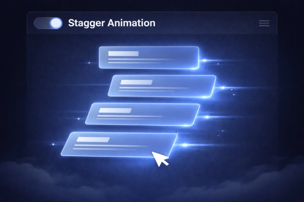
FULL CODE – Stagger Animation (Premium UI)
<!DOCTYPE html>
<html lang="id">
<head>
<meta charset="UTF-8">
<meta name="viewport" content="width=device-width, initial-scale=1.0">
<title>Stagger Animation</title>

<style>
* {
  margin: 0;
  padding: 0;
  box-sizing: border-box;
  font-family: 'Segoe UI', sans-serif;
}

body {
  height: 100vh;
  background: radial-gradient(circle at center, #0b1220, #020617);
  display: flex;
  justify-content: center;
  align-items: center;
  overflow: hidden;
}

/* Container */
.ui {
  width: 900px;
  height: 450px;
  position: relative;
}

/* Header */
.header {
  position: absolute;
  top: 0;
  width: 100%;
  height: 60px;
  background: rgba(255,255,255,0.05);
  backdrop-filter: blur(10px);
  border-radius: 12px;
  display: flex;
  align-items: center;
  padding: 0 20px;
  color: #cbd5f5;
}

.toggle {
  width: 50px;
  height: 26px;
  background: #1e293b;
  border-radius: 20px;
  margin-right: 15px;
  position: relative;
}

.toggle::after {
  content: "";
  width: 20px;
  height: 20px;
  background: #60a5fa;
  border-radius: 50%;
  position: absolute;
  top: 3px;
  left: 26px;
}

/* Cards */
.card {
  position: absolute;
  left: 50%;
  width: 420px;
  height: 110px;
  border-radius: 14px;
  background: rgba(30, 41, 59, 0.5);
  backdrop-filter: blur(12px);
  border: 1px solid rgba(255,255,255,0.05);

  opacity: 0;
  transform: translateX(150px) rotate(4deg) scale(0.95);
  filter: blur(6px);

  transition: all 0.8s cubic-bezier(0.22, 1, 0.36, 1);
}

/* Posisi bertingkat */
.card:nth-child(2) { top: 120px; transform: translateX(150px) rotate(2deg); }
.card:nth-child(3) { top: 190px; transform: translateX(150px) rotate(1deg); }
.card:nth-child(4) { top: 260px; transform: translateX(150px) rotate(0deg); }

/* Show state */
.card.show {
  opacity: 1;
  transform: translateX(-50%) rotate(0deg) scale(1);
  filter: blur(0);
}

/* Glow efek */
.card.show {
  box-shadow: 0 0 30px rgba(59,130,246,0.4);
}

.card:last-child.show {
  border: 1px solid #60a5fa;
  box-shadow: 0 0 40px #3b82f6, 0 0 80px rgba(59,130,246,0.5);
}

/* Light trail */
.card::after {
  content: "";
  position: absolute;
  right: -60px;
  top: 50%;
  width: 80px;
  height: 2px;
  background: linear-gradient(to right, #60a5fa, transparent);
  opacity: 0;
}

.card.show::after {
  opacity: 1;
}

/* Cursor */
.cursor {
  position: absolute;
  width: 30px;
  height: 30px;
  border-left: 15px solid white;
  border-top: 15px solid transparent;
  border-bottom: 15px solid transparent;
  transform: rotate(-45deg);
  right: 150px;
  bottom: 80px;
  opacity: 0;
  transition: 0.5s;
}

.cursor.show {
  opacity: 1;
}

/* Dummy text */
.line {
  height: 10px;
  background: #94a3b8;
  margin: 12px;
  border-radius: 5px;
}

</style>
</head>
<body>

<div class="ui">

  <!-- Header -->
  <div class="header">
    <div class="toggle"></div>
    Stagger Animation
  </div>

  <!-- Cards -->
  <div class="card"><div class="line"></div></div>
  <div class="card"><div class="line"></div></div>
  <div class="card"><div class="line"></div></div>
  <div class="card"><div class="line"></div></div>

  <!-- Cursor -->
  <div class="cursor"></div>

</div>

<script>
const cards = document.querySelectorAll('.card');
const cursor = document.querySelector('.cursor');

setTimeout(() => {
  cards.forEach((card, i) => {
    setTimeout(() => {
      card.classList.add('show');
    }, i * 200); // 🔥 stagger delay
  });

  cursor.classList.add('show');

}, 500);
</script>

</body>
</html>
Dengan variasi ini, kamu bisa menyesuaikan tampilan website sesuai kebutuhan. Selain itu, kamu juga bisa menggabungkan beberapa efek untuk hasil yang lebih menarik.
CSS vs JavaScript untuk Animasi Scroll
Di satu sisi, CSS sudah cukup untuk animasi sederhana. Namun, jika kamu butuh kontrol lebih kompleks, JavaScript jadi pilihan terbaik.
Selain itu, JavaScript memungkinkan kamu membuat efek seperti scroll trigger atau animasi dinamis. Meski begitu, tetap gunakan secukupnya agar performa website tidak terganggu.
Kesalahan yang Sering Terjadi
Banyak orang langsung menambahkan animasi tanpa perencanaan. Akibatnya, website jadi berat. Selain itu, terlalu banyak efek juga bisa mengganggu pengguna.
Kesalahan lain yang sering muncul adalah animasi tidak smooth. Biasanya ini terjadi karena penggunaan properti CSS yang berat atau tidak optimal di mobile.
Tips Biar Hasil Animasi Lebih Maksimal
Supaya hasilnya lebih maksimal, gunakan transform dan opacity karena lebih ringan. Selain itu, pilih easing yang smooth agar animasi terasa natural.
Kemudian, batasi jumlah animasi agar tidak berlebihan. Terakhir, selalu uji di perangkat mobile supaya performanya tetap stabil.
Kesimpulan
Sekarang kamu sudah paham cara membuat animasi scroll CSS dengan berbagai variasi yang smooth. Dengan kombinasi CSS dan JavaScript, kamu bisa menciptakan tampilan website yang lebih hidup, modern, dan nyaman digunakan. Yang terpenting, gunakan animasi secara bijak agar tetap ringan dan efektif.
FAQ
1. Apakah animasi scroll bisa tanpa JavaScript?
Bisa, tetapi JavaScript membantu membuat efek lebih dinamis.
2. Apa itu scroll reveal?
Scroll reveal adalah teknik menampilkan elemen saat di-scroll.
3. Apakah animasi scroll memperlambat website?
Bisa, jika tidak dioptimasi. Gunakan teknik ringan agar tetap smooth.
Kalau kamu ingin eksplorasi lebih dalam, kamu juga bisa belajar dari sumber berikut:
– Dokumentasi resmi CSS Animations dari MDN
– Panduan Intersection Observer untuk animasi berbasis scroll
– Inspirasi desain dari CodePen dan Dribbble
– Jasa Artikel SEO Friendly & Tema WordPress Premium hanya di :
Dengan memanfaatkan sumber di atas, kamu bisa mengembangkan animasi yang lebih advanced dan profesional.
Tagged with:
animasi scroll cssanimasi scroll javascriptanimasi website csscara membuat animasi scroll cssefek scroll cssscroll animation css jsscroll reveal csssmooth scroll css
Berbagi wawasan dan tips praktis seputar dunia digital.
You might also like


 Bisnis
 Coding
 Investasi
 Pendidikan
 Review
 Tips
Tips


